10 Plus 1 Commandments for the Modern Mobile App Designer
10 Plus 1 Commandments for the Modern Mobile App Designer
Sung to the tune of “Ain’t no mountain high enough:”
Although we are miles apart
If users ever need a helping hand
I’ll be there on the double tap
There ain’t no resolution high enough
Ain’t no bandwidth low enough
Ain’t no screen size wide enough
To keep me from getting to your app.
Shout out to Medium’s recent release notes for the inspiration behind the prose above. App makers and designers can and should show their human side and be more user-focused. But more on that later in the article.
So here are some simple, yet informative rules for the modern mobile app designer.


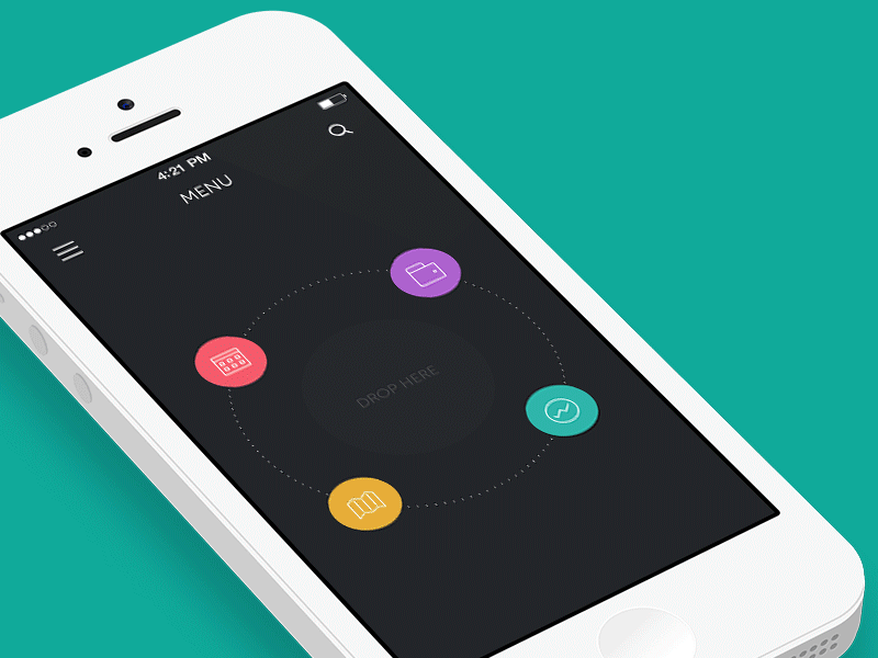
Don’t hide features behind gestures
In a multi-touch user interface (UI), many apps choose to hide features behind gestures, such as a long-press or two-finger-tap. It’s fine to use gestures like this to trigger features, but always make sure those features are also accessible with a visible control.
Your UI is the only way for you to inform your users about features. If you don’t have a visible control for your feature then it might as well not exist.
The exception to this is when a particular gesture is used in a consistent manner across the entire operating system and your app uses standard operating system controls. In this case users can expect the same gestures to work if they are used to them elsewhere (See Build to the platform).
Hiding features behind gestures also makes it more difficult to support accessibility features in your app, which the operating system might otherwise give you “for free.”
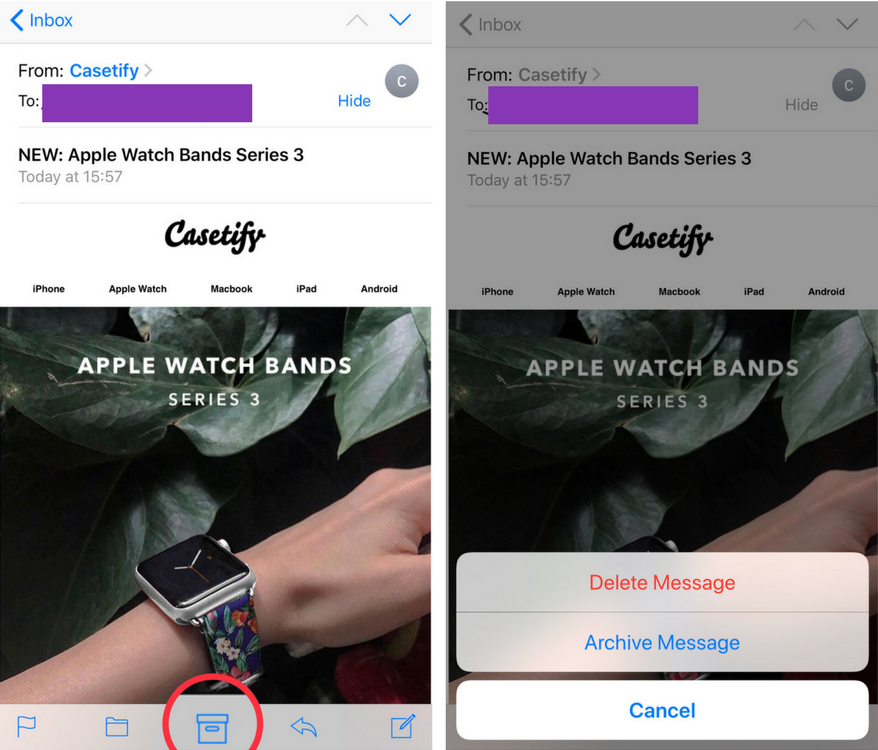
For example, in the stock Mail app on iOS, the “delete message” feature is hidden behind a long press of the “archive message” icon (circled in the image below).

Get rid of features
If you have trouble finding a place to put features then it could mean it’s time to start dropping features and try to streamline your application.
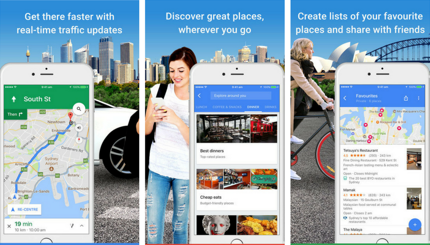
Think about Google Maps and how many hidden features there are. The app is a combination of location info and history, directions, local listings, as well as things like social sharing.

So unless you’re Google and have the manpower to merge different platforms into a single app, resist putting that extra feature in altogether. Many of the best applications have a singular focus and limited feature set.
Culling features doesn’t make your app worse. It makes it better by giving your core features the attention they deserve and making your app easier for your users to use.
Don’t use hamburger menus
If your app has a lot of features, it’s tempting to use hamburger menus. Data has shown hamburgers are less efficient, have low discoverability and may clash with the platform navigation patterns.
It’s okay to use them if “the menu items you’re going to hide behind the hamburger icon fall below the 80% of regular usage.”
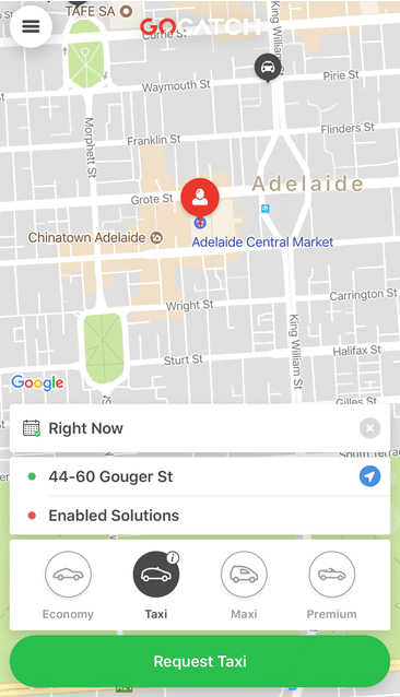
In other words, if the user can accomplish the main task from the main screen, then the secondary items like settings could go behind the hamburger menu. The taxi booking app GoCatch is a good example for this.

What happens when you tap on the hamburger icon
If your app is really complex and culling features isn’t feasible, use hamburger alternatives such as: tab menu, tab menu with “More” (e.g. Facebook app), horizontal scroll menu, drop down menu etc.
Support accessibility
Humans are not all the same and out of the box, they come configured with different abilities. So make sure your application takes this into account.
Some simple things you can do include increasing colour contrast for better readability of text, or accounting for people with colorblindness.
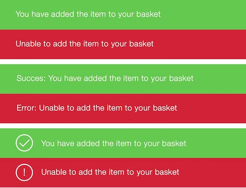
Don’t rely just on colours to communicate different states: use extra cues such as icons or text to signal different states (as shown below).

For users with special needs, try to leverage what is given to you by the platform. iOS, for example, will be able to read most of the screen for users with low vision — if you use the standard controls. You can also annotate UI controls with labels for screen readers to use.
Use animation to be helpful
Motion helps your users build a spatial map of your application. When a user taps a button and a screen pushes in from the right edge — and the back button appears on the left edge — the user is aware on some level that they have navigated more deeply into your app.

Most motion comes for free if you stick to standard operating system navigation. But if you’re building your own, always ask yourself: Does this animation help the user or does it turn your app UI into a Disney Movie?
Avoid lengthy in-app copy
Mobile screens are small and your users want to get to the point. Don’t bog them down with lengthy in-app messages.
Simplify the copy in your app and make sure it’s approachable, useable, and understandable. Take a look at how cluttered this in-app copy is. It almost feels like a mini website crammed into the small mobile screen.

Avoid pop-ups unless absolutely necessary
Many users will just tap whatever button pops up on an alert without reading it, just to get it out of the way (e.g. asking users to rate the app).

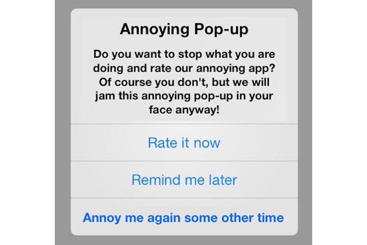
So resist prompting them unless it’s absolutely necessary. Example situations where a pop-up alert is acceptable:
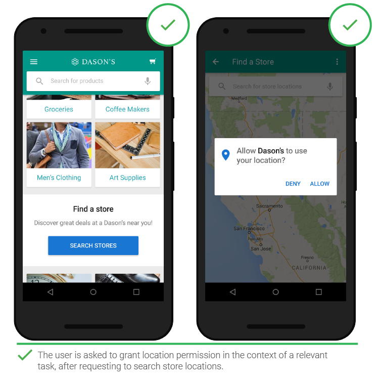
- Asking for critical permission in initial launch, e.g. access the camera if it’s a photo-taking app
- When deleting important things
When you do use pop-up alerts, keep them short and relevant to the task at hand.

Avoid generic buttons like “OK,”“Cancel,” and “Yes” or “No.” Instead, write the specific action that will occur when the button is pressed such as “Delete,”“Upload,” and so on.
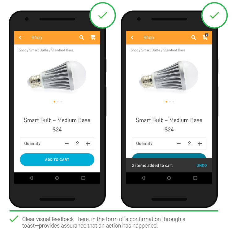
For secondary alerts, consider using non-modal notifications. These allow your users to continue interacting with your app while a notification is presented.
You might use these for status alerts like completed downloads, adding items to a shopping cart, and so on.
Also, you can provide users with the ability to undo their actions instead of having them confirm every action with an alert (see image below).

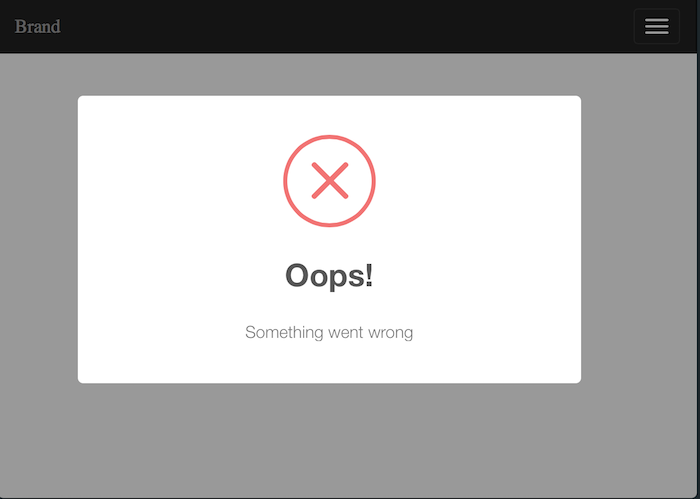
A note about error alerts: if you have to use pop-up alerts, tell users what to do to fix the problems. Don’t be like this…

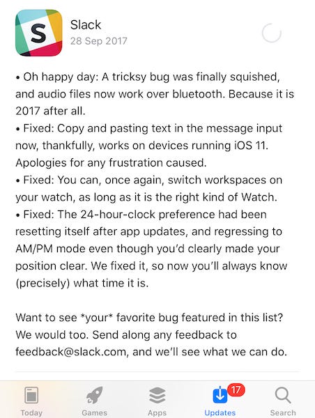
Don’t use “Bug fixes and performance improvements” in your release notes, ever
This is a rare chance to communicate directly with your users! See the difference between a “filler” release note and good ones below.

One the most memorable app release notes I’ve come across is from Medium. They have been cleverly mixing storytelling and useful information, as shown in the example below.

Slack uses the space to communicate new changes as well as encouraging user feedback. After all, would you rather read a corporately dry message like “We’re always working hard to improve the app,” or something more human with a bit of humour and still on-brand?

Be smart about user feedback
Listen to your users but don’t follow what they say — be opinionated about how your app should work
Your users are using your application. That is, they are paying you for your decisions, your thoughts, and your design. Don’t always defer to what they say when they have suggestions.
If a user wants a particular feature then think about why they want it — don’t blindly implement feature requests. Use them as an opportunity to re-think the fundamental workflow of your app and what it is they are trying to do.
Perhaps your users would be better of with a different app entirely? If so, don’t hesitate to recommend it to them.
Be smart about user testing
Watch users interact with your app with minimal interaction, hold back on prompting, or leading discussion from you. Learn mainly from observing.
Keep an eye out for opportunities. You may learn an amazing insight that you never planned on by ignoring your list of questions for a moment, waiting a little longer in awkward silence or asking “why” a couple more times.

To further prevent researcher bias, reframe the purpose of your research so as not to “validate” the design, but to “test” it.
Remember: “If a usability study found nothing to improve in a design then that only proved one thing: that the test was done wrong.”
Build to the platform
Whether you intend to build your app on a single or multiple platforms, you should be aware of the specific design conventions for each platform (e.g. iOS, Android, Windows Mobile).
From there, you can decide between these options:
- Strike a balance between adhering to platform conventions and branding conventions (e.g. Facebook app)
- Stick to platform conventions (e.g. WhatsApp app)
- Stick to branding conventions (e.g. Instagram app)
This depends on things like how complex your app is and what your app’s objective is in relation to your overall digital strategy.
Generally, more complex means more time to build and more user onboarding needed. So in this case, it’s better to use what’s already available in the platform to reduce development time and the learning curve for users.
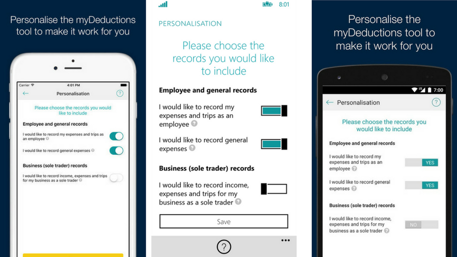
The Australian Taxation Office app has customised UI elements using platform-specific conventions. Notice how the toggle is consistent with each platform’s design, while still maintaining the teal brand colour chosen by the ATO.

Final words
Here’s what you can take away from this:
- Cut down features to streamline your app
- If you can’t cull features, don’t hide critical ones behind gestures
- Don’t use hamburger menus (you’re not McDonald’s)
- Be accessible
- Be animated, not crazy
- Less text, more meaning
- Pop-ups = annoying = higher chance of uninstall
- Use those extra minutes to write good release notes instead of checking social media
- Don’t listen to your users. Watch them
- Know thy platform
Source
https://uxplanet.org/10-plus-1-commandments-for-the-modern-mobile-app-designer-7370353fb034

Healthcare Mobile App Development Trends 2018

Best Practices for Mobile App Ads Monetization

Viridian Works With 1st Touch On Digital First Mobile App
About Author