A Usability Study on Starbucks’ Mobile App – prototypr
A Usability Study on Starbucks’ Mobile App
As a part of my Advanced Usability Testing class last semester, my team and I conducted a Usability Study on the Starbucks mobile application. This app allows users to pay for purchases, earn rewards, and order drinks in advance before reaching the store.
My Role: Prepared task list. Main observer/note-taker during test sessions. Identified and prioritized usability issues. Complied a video of usability issues. Provided recommendations.
Duration: Spring 2017, INST702 Advanced Usability Testing
Tools & Methods: Usability testing, Pilot testing, Document camera, Note taking, Survey, Qualtrics, Think aloud
Team Members: , ,
The purpose of our study is to :
- Identify potential usability and design problems in the current app.
- Analyze the issues to determine the causes.
- Provide recommendations for improving the usability of the app.
Based on 15 usability testing sessions conducted in April 2017, our team has identified 5 most critical usability issues, provided a corresponding list of recommendations, as well as insights (likes, dislikes, and suggestions) from our participants.
Methodology
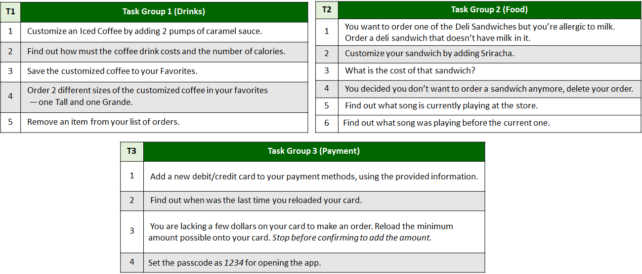
Task List
In order to evaluate many of the app’s vast functions while keeping the sessions short, we created 3 sets of tasks — each with a different focus. These were all programmed in Qualtrics, which automatically assigned participants to one of the three task groups. Below is the finalized list of each task in each group, after 2 rounds of pilot testing to revise any unclear wordings.
Sessions
To keep the conditions of our tests as natural as possible, we conducted and recruited participants at a Starbucks Store.
Approach: Think-aloud method
Data Collection: Screen recording with document camera, Note-taking
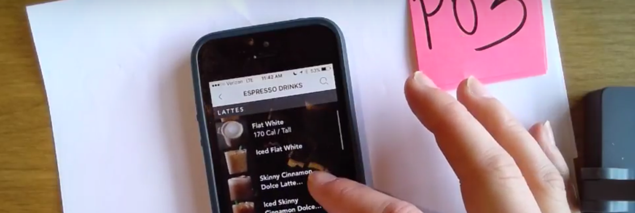
Device: iPhone6 for iOS users, SS Galaxy S7 for Android users
Location: Starbucks store on Cherry Hill Rd., College Park, MD
The process was simple and broken down for each for us to concentrate on a certain aspect of the process. One of us would bring the participant to our table and brief them up on what test we were conducting and how they would have to go about it. We had them verbally approve our consent speech, which said that we would be using the data and recording the phone screen but we won’t be revealing their identity. Then the participant would fill out a background questionnaire. According to their choice, we would provide them an Android or iOS device. The role of each person in the team is as below:
- Tech support: Start & stop recording the camera, take notes
- Timer: Stopwatch & notes down time taken for each task, prepares device/resets app
- Observer: Write down observations, main-note taker
- Moderator: Runs the session, sits with the tester (introductions, etc.), notes observations
Participants
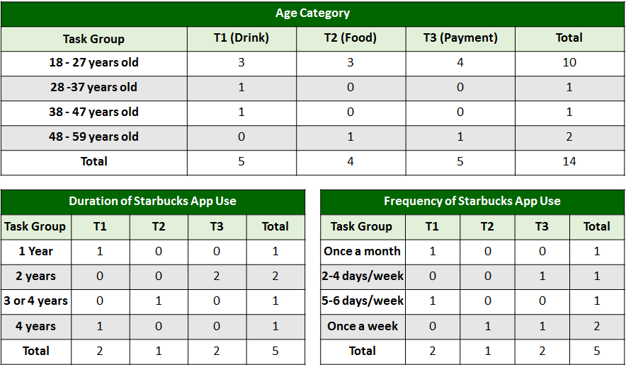
Across two rounds of usability testing, both within the Starbucks store and remotely, 15 participants were randomly assigned to one of the three task groups mentioned above. Due to technical difficulties with the first usability test, demographic information was collected on 14 of the participants. Fourteen participants self-identified as iPhone, and only one participant completed the test on an Android.
Of the five participants who self-reported previously using the Starbucks app, all five participants have been using the app for at least one year, while another two stated they had used the app for three to four years. When discussing whether participants used the app previously or not, three participants spontaneously mentioned only using the app to pay and had never ordered from it.
Results
Task Completion Success Rate
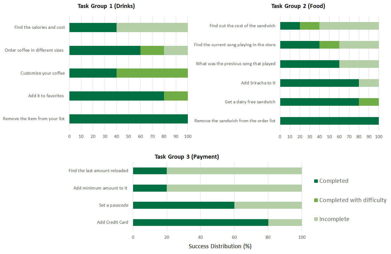
From the data collected during our in-store sessions with the users, we deduced the task completion success rate. We had 5 users test each of the 3 task groups (15 users in total). The success distribution for the 3 task groups are shown below, ordered by %Incomplete to distinguish tasks with the most difficulties.
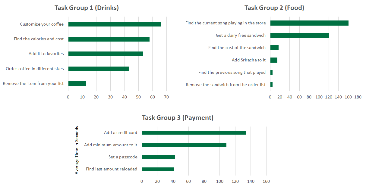
The graphs below show the average time taken by the 5 participants to complete each task from a particular task set, ordered to distinguish tasks that took the longest.
Survey Results
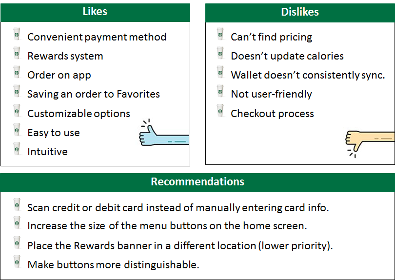
After participants completed their randomly assigned task set, each participant was asked to discuss their likes, dislikes, and recommendations on the app. We identified the most common themes as below.

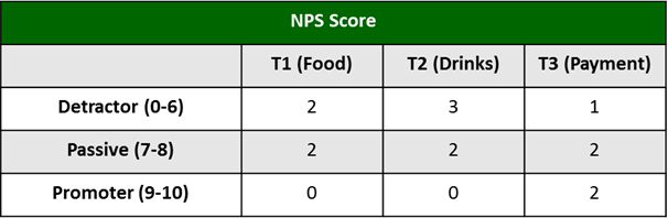
Net Promoter Score (NPS)
Participants were also asked the NPS via the following question: “How likely are you to recommend the Starbucks app to a friend, family member or colleague?”. The average NPS was 6.57 out of 10, which is right between a detractor and passive respondent score. The NPS score subtracting the percent of promoters from the percent of detractors (14.29% — 42.86%) was -28.57. Overall, participants are not likely to recommend the Starbucks app to a family member or friend.
Usability Issues
From the results of our observations and surveys, we consolidated a list of usability issues and then evaluated them based on a severity rating scale of 0 to 5 (0 being not a problem, 5 being a usability crisis). Please refer to this link for a video compilation of the issues we found during the test —
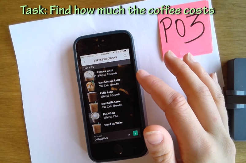
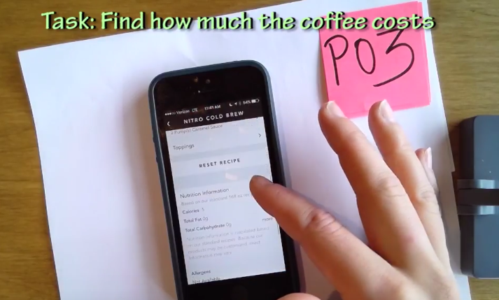
- Difficulty in finding the price of an item (Rating 5): The application only shows the price after a user have gone through to the checkout section. Many users have expected the price to be shown earlier on in the process while they were selecting their items — often times going back to check on the main ordering menu. Additionally, since the checkout process requires a store location to be defined, many users backed out before they reach the point where they see the price.
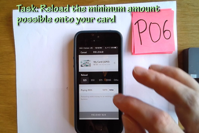
2. Minimum amount to reload is not clearly visible (Rating 4): After clicking on the drop-down list to select the reload amount, the users are shown options ranging from $25 to $100, with an additional “Other” option. Clicking on “Other” would reveal that the actual minimum amount to reload is $10.
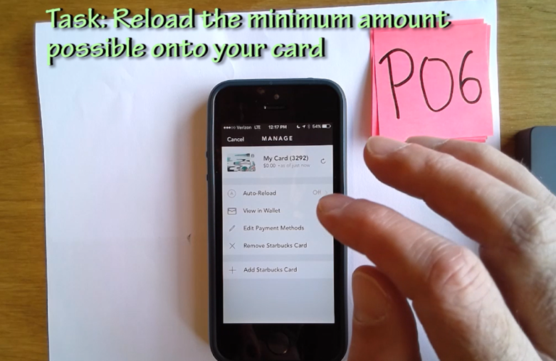
3. “Add Payment Methods” is not clearly visible (Rating 4): After clicking on the “Manage” in the payment section, users have the option to “Edit Payment Methods” or “Add Starbucks Card”. Since the user wanted to add a credit card, the second option seems very promising.
4. Misleading nutrition facts after drink customization(Rating 3): Although the application allows users to customize their drink, the nutrition facts listed are not updated accordingly. Users have reported that they did not realize that the calories are no longer valid after their customization. However, the application does update the calories when users change the drink size.
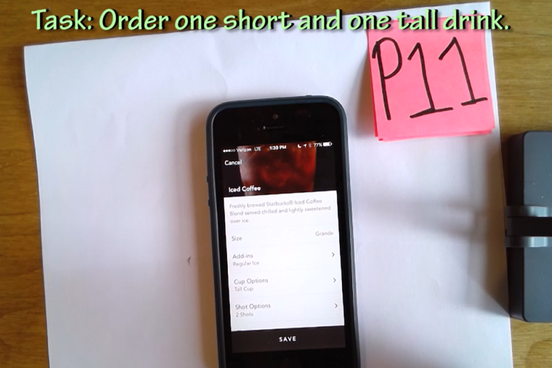
5. Cup size option may lead to misunderstanding (Rating 2): For several drinks (such as an Iced Americano), the users may select the size of the cup to be served in, which is different from the actual drink size. One of our users misunderstood the cup size for the size of the drink.
Recommendations
From the usability issues we’ve identified in the previous section, we provide several suggestions for making changes to the application for a better user experience. We rate these recommendations on a scale of 0 to 5 (0 being nice to have, 5 being strongly suggested).
- Add each item’s price to the menu (Rating 5): Many of our participants had difficulty finding the price and expect the the prices would be listed on the menu. Providing this information beforehand avoids the trouble of having to select the store and go through to the checkout process. One of our participants also pointed out that price plays a major factor in her decision-making and having the price right on the menu would make it easier for comparison.
- Make the minimum amount to be reloaded clearly visible in the options (Rating 4): For a more logical understanding, the first options shown should start with the minimum amount then incrementally increase with a “More” option for higher values. For example the options should be $10, $15, $20, $25, $30, More.
- Add a “Add Payment Methods” option (Rating 4): Instead of requiring the users to go inside the “Edit Payment Methods” section to add a credit card, there should be an additional “Add Payment Methods” option clearly visible at the same menu level with “Add Starbucks Card”.
- Update nutrition facts to reflect drink customization (Rating 2): The application can implement additional features to calculate new nutrition facts based on the user’s customization. Alternatively, a note saying that the calories does not account to customization can be added to the top of the nutrition list if this change are not to be implemented.
- Change the terminology for “Cup options”(Rating 2): “Size” and “Cup options” can be easily misunderstood, hence the cup size option should use a less ambiguous terminology, such as “Container size”.
Reflection
While we are aware that several of the identified issues may have been a result of stakeholder’s decisions, our team has evaluated the studies based on actual observations with real users with the goal to report these findings as accurately as possible. Our team have gained an articulate amount of experience in performing hands-on usability testing, recruiting participants in a real environment, and drawing conclusions from our records and observations. We hope this study would bring useful insights for future enhancements.
Lastly, I would like to share the 3 most important lessons I’ve learned from this project:
- Finding a balance between the business goals and user goals is crucial to the design of a successful application.
- The document camera drew our participants interest and evokes professionalism. This was extremely helpful in our recruiting process, especially with the lack of tangible incentives.
- Determine what needs to be done to reset the testing device beforehand. It is extremely important to clear all added cards, settings, and small details before proceeding to the next session.
Source
https://blog.prototypr.io/a-usability-study-on-starbuckss-mobile-app-375a840311da

Could a mobile app help treat mental health problems?

Get the REALTOR® Action Center Mobile App!