Best mobile app UI designs of 2017 – UX Planet
Best mobile app UI designs of 2017
As 2017 draws to a close, we take a look at some of the best mobile app UI designs that made an impact and stood out for all the right reasons
The end of 2017 is drawing near. It’s been a great year in UX design with notable rebrands from popular companies such as Dropbox, Kickstarter and HuffPost. As ever with a UI design rejig, there’s the good and the bad. This got us thinking about some of the best mobile app UI designs we’ve seen this year.
We cast a wide net while seafaring the internet to find some of our favorite designs this year as well as a few special picks that inspired us from dribbble. Read on as we look back over the year and discuss what we love about these mobile app UI designs…
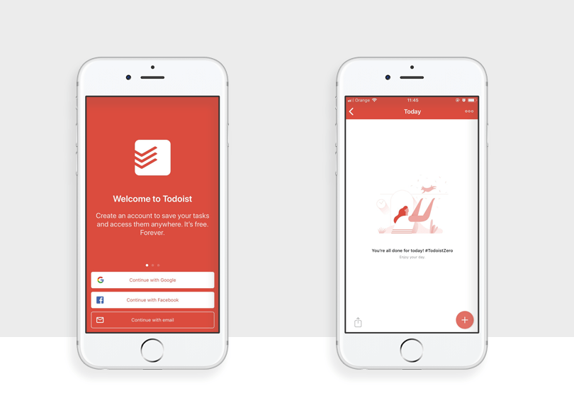
Todoist
Todoist, the app that helps you get your life together. To do list apps are a dime a dozen in this busy, wild world of UX design but what makes Todoist pop is the interesting choice of color palettes, including red and orange — an unusual choice for UI design. But it works, especially when combined with their unique illustrations and clean and straightforward UI design. It’s just what you need with a to do list app — few distractions and an easy to use interface.
What we love: Friendly and encouraging UX copy. Psst, don’t underestimate the importance of copy in your UI design.
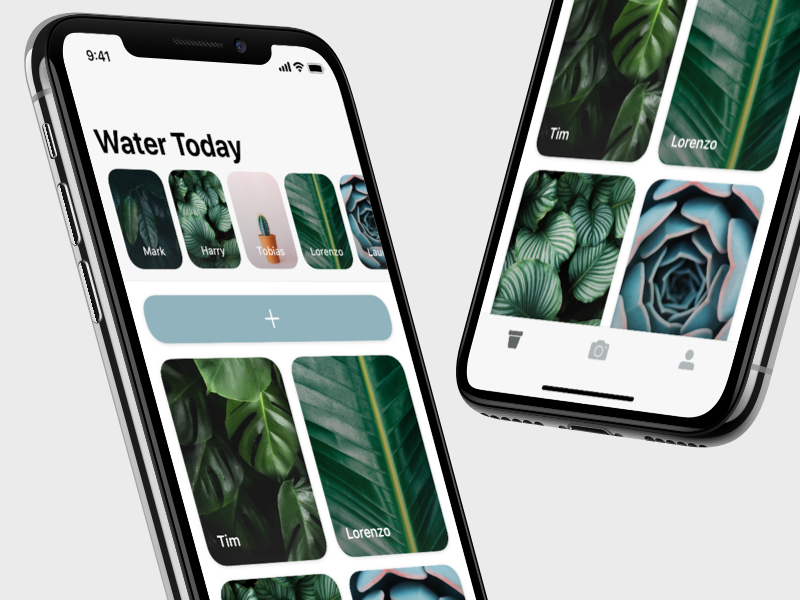
Potted
Potted isn’t a real app, unfortunately. But we wish it were. Potted is a concept by Judah Guttman for plant lovers who are often left with dead, unwatered plants. What’s great about this app’s slick UI design is its smart use of cards to represent the plants in your life and the scrolling timeline at the top, showing you which plants need to be watered. This is one stylish plant tracking app that looks right at home on iOS.
What we love: Great use of imagery and the native iOS feel
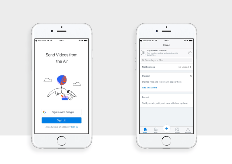
Dropbox
Dropbox really pushed the boat out with their rebrand this year. The typographic choices — in this instance, Sharp Grotesk and Atlas Grotesk — were a delightful surprise among a sea of Proxima Nova and Futura. The rebrand brought with it a new muted color palette and whimsical hand drawn illustrations which feature on their website and mobile app — making Dropbox’s mobile app UI stand out from the crowd for all the right reasons.
What we love: Unique illustrations which add real character
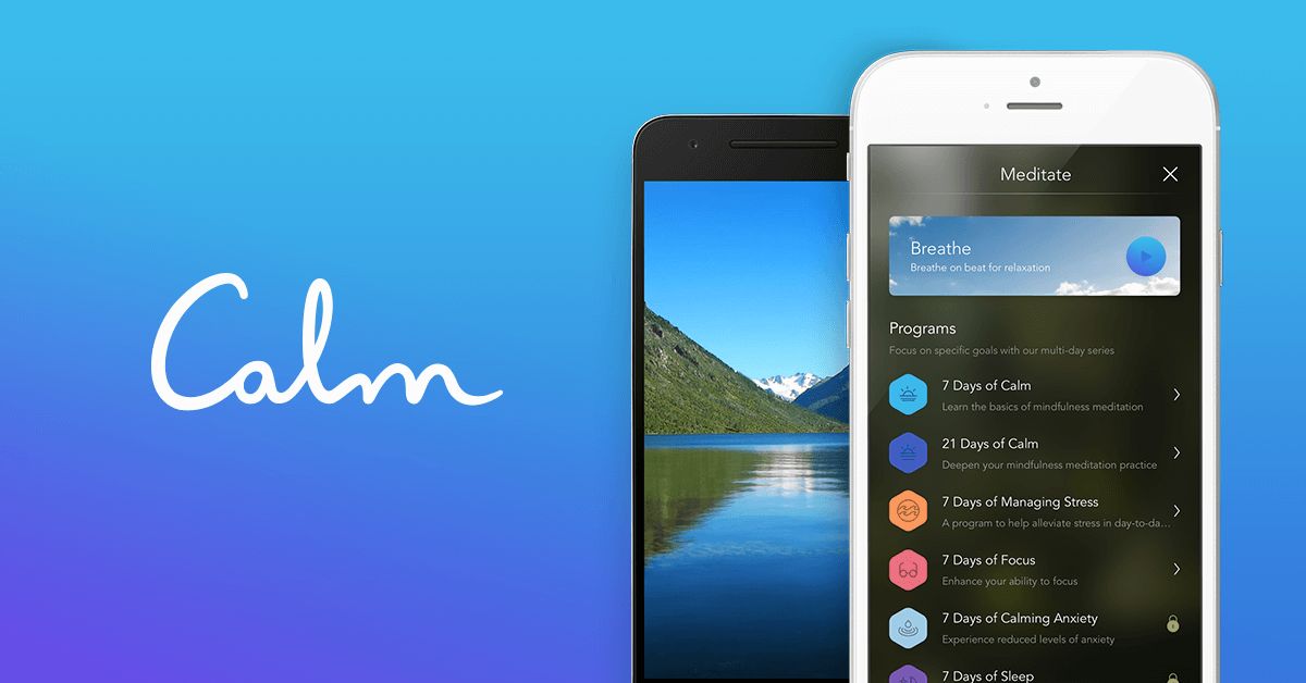
Calm
Breathe in, breathe out. Breathe in, breathe out. Calm is a mobile app which helps you meditate. It’s full of exercises, music, stories and methods which are all presented beautifully in the UI. Thankfully, there’s no cause for stress with this mobile app’s UI design. It’s serene, clean and makes you want to start meditating immediately instead of continuing to lie to yourself that you’ll start one day. Just close your eyes!
What we love: Subtle use of gradients and clean typography
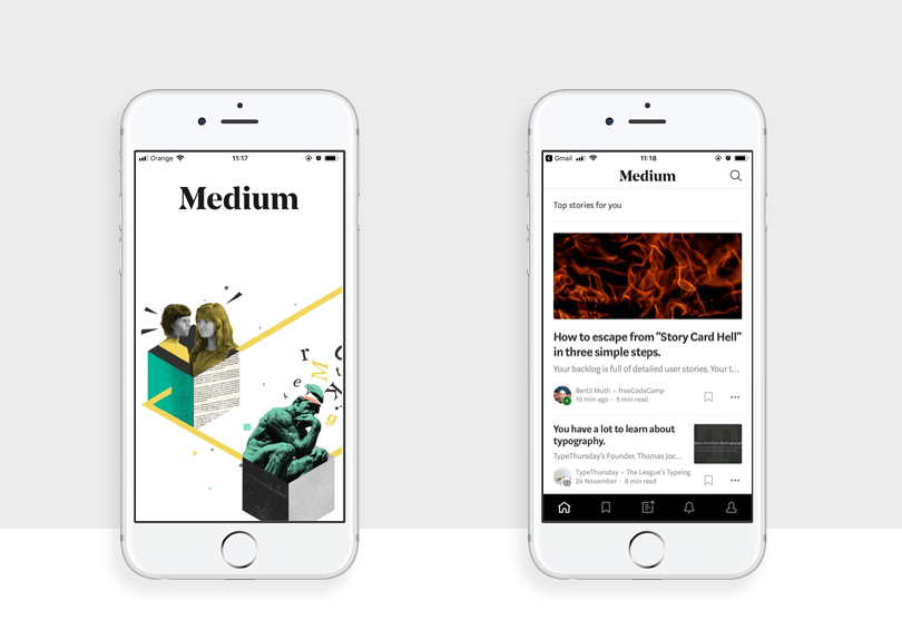
Medium
Medium is another company that got a new logo this year, after introducing its new subscription model. In an effort to realign the brand as an authority in editorial writing, Medium decided to use a bold and wing tipped serif (Noe Display, if you’re curious) as their logotype — perhaps as a nod to the golden days of newspaper publishing.
Along with fetching illustrations from Nate Kitsch, Medium has managed to recapture its identity after a few years in the wilderness and this shows in the mobile app UI design.
What we love: The new logo and light (but right!) color palette throughout the app
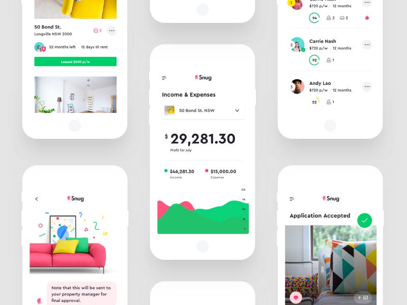
Snug
Another fave from dribbble is this mobile app UI design for Snug, a company that makes renters’ lives easier. What’s interesting about this UI design from Balkan Brothers is the cool watermelon color scheme and geometric font, Cera Pro. Combined with the minimalist, distraction free interface, Snug looks to be targeting the right demographic with their design.
What we love: The bold and fresh color choices
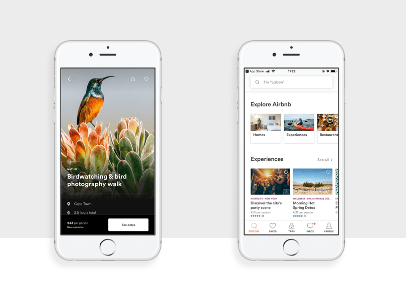
Airbnb
Airbnb has an enormous team behind their app and it shows. The design embodies the brand and there’s coherency between the mobile app UI design and the web design — consistency means that the Airbnb experience is the same no matter what device you’re using. The mobile app demonstrates Airbnb’s commitment to their visual design language — it’s very welcoming and accessible for the global community which uses its services.The engaging use of photography for their new local experiences is enticing once mixed with on-brand typography and cool copy.
What we love: The seamless Airbnb experience across all platforms
Conclusion
2017 has been a continuation of minimalist, sleek mobile app UI design that we saw in 2016, taking inspiration from popular graphic design movements such as De Stijl and Bauhaus. Arguably, the minimal aesthetic in 2017 is more lean and better developed as companies focus their attention on good typographic choices, appropriate visual hierarchy and positive use of white space.
Source
https://uxplanet.org/best-mobile-app-ui-designs-of-2017-b632a02b2594
How to create your first mobile app?
Nintendo announces closure of Miitomo, its first mobile app