The Best Mobile App UI Designs of 2017
Can you believe another year has come and gone? 2018 is here, and it’s a great time to reflect on the best mobile app UI designs of 2017. We went over some eventful apps, from the well known to the obscure. And our goal was to always bring you the best mobile app UIs we came across.
In our final tribute to 2017, we’re pouring back over those top designs from all the way through . Our goal is to bring you the best of the best in terms of the apps we discussed last year. Let’s get started!
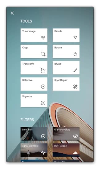
Snapseed is a comprehensive photo editing app by Google. The ability to go back and re-edit based on the saves you’ve previously made makes this app my favorite photo editor.
 Source:
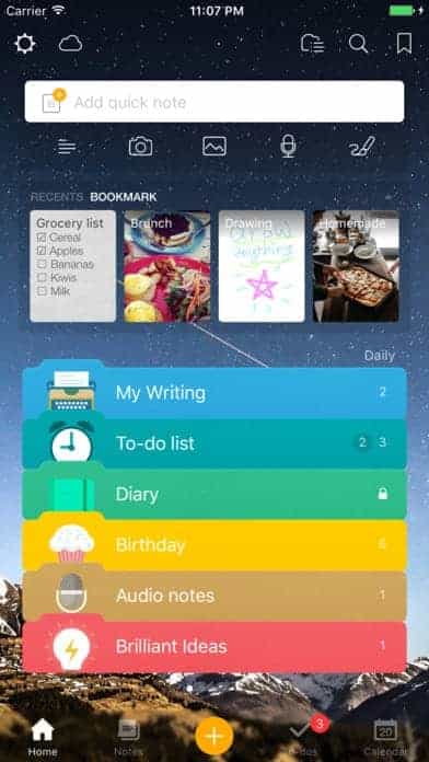
Awesome Note 2 combines scheduling and notes to perfection, including images, voice recording, and even drawings. Awesome Note 2’s design gets as granular as you’d like, with folders to organize your notes and to-do lists. It’s image and card heavy to keep everything in the right place and still visually appealing.
Get Awesome Note 2 on .
 Source:
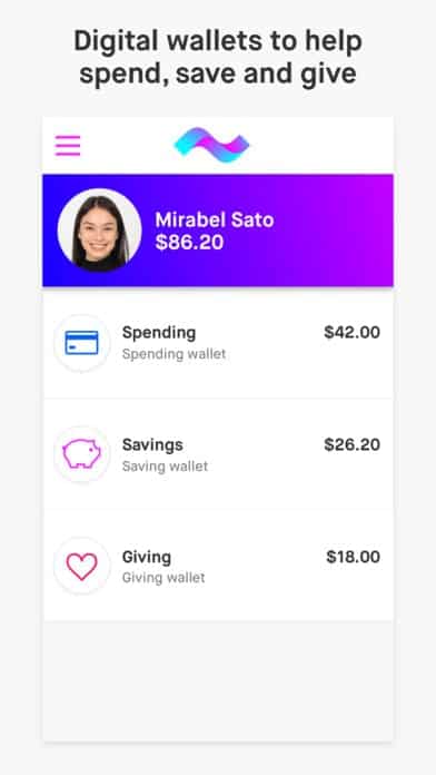
This personal finance app helps users track spending by category, save money, squash debt, and build wealth. The mobile app experience features little bubbles that you can “squeeze” to focus on, then they expand into beautiful graphs showing your individual stats.
Source:
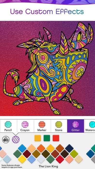
In an interesting switch of gears, Disney recently released a coloring book app for adults. The features that make it different are the color palettes that directly correspond to the movie the template is from, as well as glitter and pixie dust options that are especially appropriate for Disney creations. The mobile app UI is easy to understand so that it’s quick to create and share the perfect artwork.
 Source:
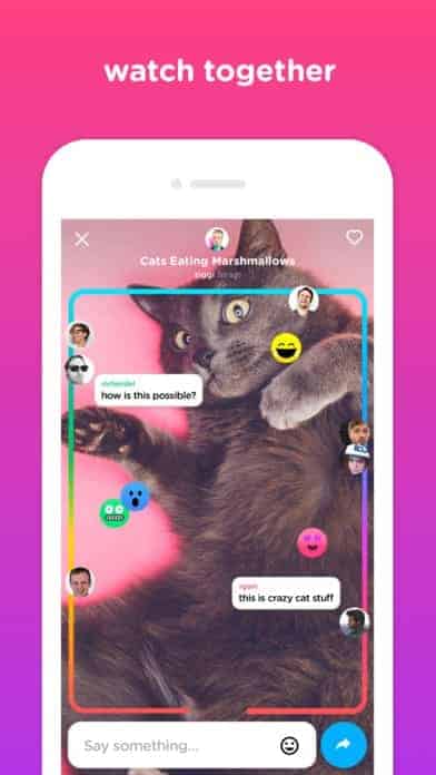
Uptime is a new app that makes watching videos a social experience. The UI is super colorful and animated. This design makes Uptime stand out from other companies that have attempted to make co-watching apps in the past.
 Source:
Waze revolutionized how efficiently we get around, with animated maps that help us choose the best route. And, on top of that, its designers pulled the app together in an animated and enjoyable mobile app UI design.
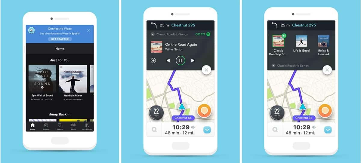 Source:
Apple’s recent Clips app (with over in its first 4 days!) focuses on making videos. While Clips makes longer and higher quality videos, it still uses easy to understand icons and Apple’s classic minimal design to help users accomplish this.
 Source:
Sway helps you meditate and move mindfully so that you can get rid of distracting thoughts. Sway’s interface includes fuzzy pictures with calming colors, and they give straightforward instructions. For an app that’s all about the sound and feeling, they still accomplish a lot with their mobile app UI design as well.
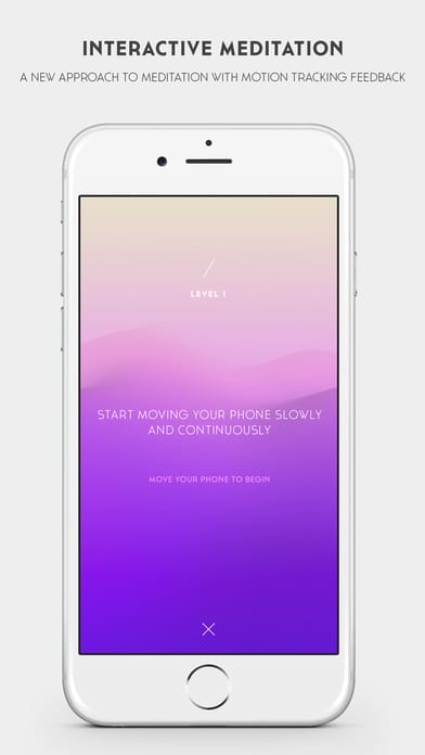 Source:
Heal is taking us back to the days of house calls, with the help of technology. You might be pulling up the app when you’re having a medical problem, so its design needs to put you at ease as well. It has a muted color palette of light blues and pink.
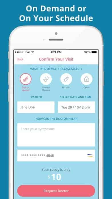 Source:
Addy is a photo editor that delivers the filters we are familiar with and adds in colorful backgrounds, stickers, and customized text to bring any photo to life.I appreciate how animated the app is and how the creators were able to fit in so much without making the mobile app UI design cluttered at all.
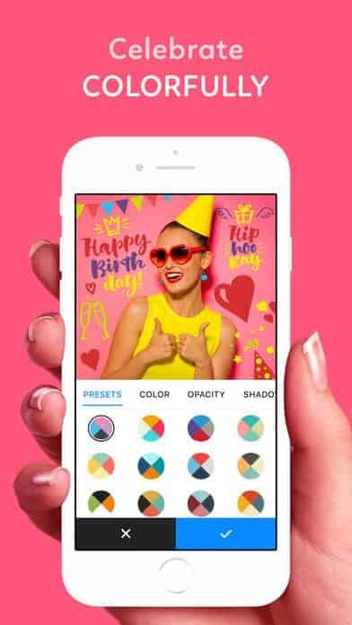 Source:
Teaching your kids about finances sets them up for success as adults and Current has taken on the task of helping with this. The app’s design is colorful to keep it fun for both parents and kids, but still has the straightforward and clean layout of financial apps we’re used to.
 Source:
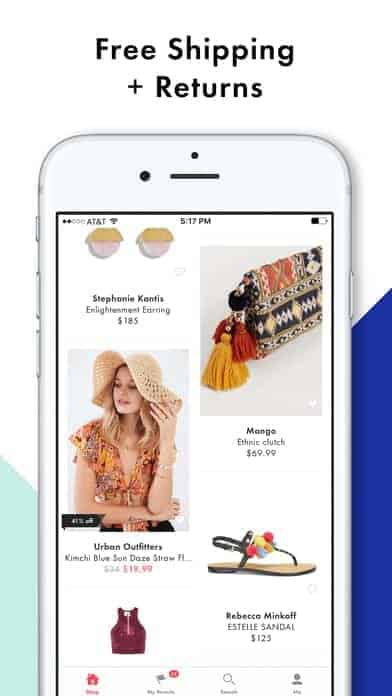
Spring is a shopping platform that brings together 1,500 brands with a number of price ranges. The mobile app UI is crisp and minimal.
 Source:
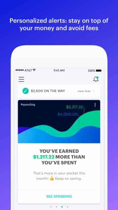
MoneyLion is a personal finance app that helps users check and improve their credit score, apply for a loan, and boost their savings. That’s quite a lot for one app to take on, but the clean and sleek mobile app UI of MoneyLion makes it possible.
 Source:
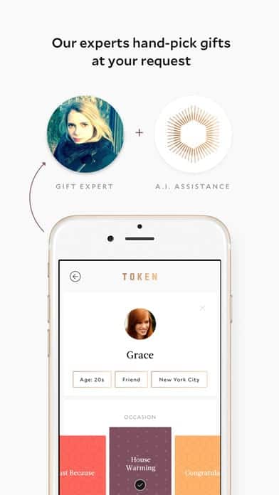
Token’s AI-powered platform scours their database of potential gifts for the right one. Then when it narrows down the recommendations, you get to make the final call. This app is definitely targeted towards busy users, so its mobile app UI design is understandably minimal.
 Source:
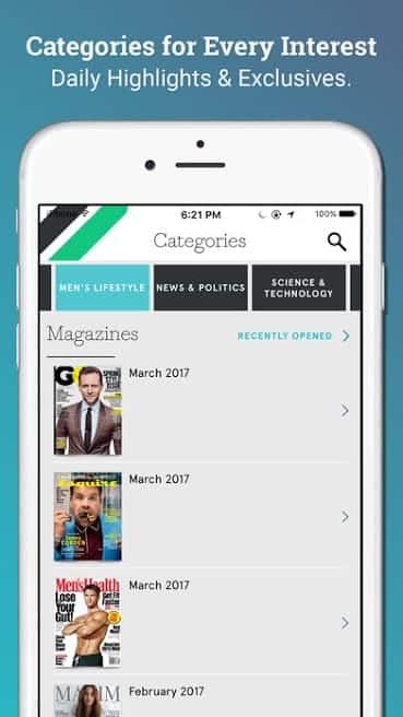
Texture offers access to over 200 magazines within one app. What I love about the mobile app UI is that it manages to pull together all of those magazines into easy to navigate categories that put the colorful covers front and center.
 Source:
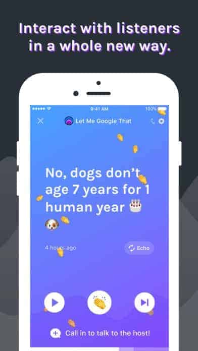
Anchor is not your dad’s NPR station, it’s a sleek podcast app. It’s fun, colorful, and full of emojis. Their use of custom icons for each category and podcast compliments the bright and ever-changing mobile app UI.
 Source:
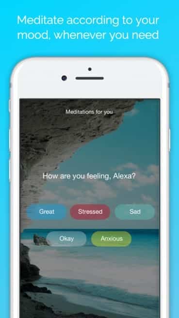
Aura ’s a meditation app that works around your schedule, to help you practice mindfulness and check in with your emotions in just a three minutes each day. It has a calming muted color palette, with the ability to choose mediation sessions with your favorite teacher.
 Source:
Sift erases that buyer’s remorse by helping shoppers get money back when an item they bought dips in price. The best part is that they pull all of this information into a smooth interface that has custom animated icons that keep the experience light-hearted. The mobile app UI will pull you in and make you wonder how you ever made purchases online without Sift.
 Source:
Packr makes packing even easier with 24 different packing lists depending on where you’re going, for how long, and what the weather will be like. When building out your list, it has great icons to make the process of picking how you’re traveling, where you’ll be staying, and what you’ll be doing a bit more fun.
Source:
Lonely Planet just came out with a new app that allows you to follow the adventures that fellow travel lovers post, as well as chronicling your own. The mobile app UI is based on the fantastic images travelers want to share with the world. The bold color palette they infused into the app is certainly a plus.
Get Trips by Lonely Planet on .
 Source:
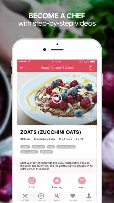
Tasty is a great app if you want to discover new recipes and get step-by-step instructions using video. On top of how useful it is, it’s got the cutest design, as if you’ve just stepped into a quaint cupcake shop. Tasty has a candy-coated color palette, with bright turquoise and pink.
 Source:
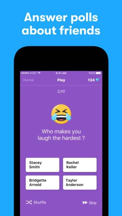
A new app aiming to kick bullying to the curb is tbh, it’s spreading like wildfire. So rapidly that in October! It’s an app that has friends and peers interact anonymously, but only through compliments. The mobile app UI is full of emojis and bright colors, perfect for its middle and high school target market.
 Source:
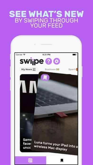
Swiipe is a news app fresh off the press by a 14-year-old developer. The design helps users focus on the news, with tabs for new and saved stories, categories along the top, and settings to change the publications you follow quickly.
 Source:
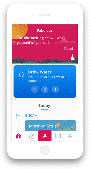
Fabulous is a motivation app that helps users improve habits and decrease stress. It has a very animated UI, with color schemes that go along with the goal it aims to help the user with. For example, the meditation section has more muted colors, while the sleep improvement section has dark colors that fit a nighttime theme.
 Source:
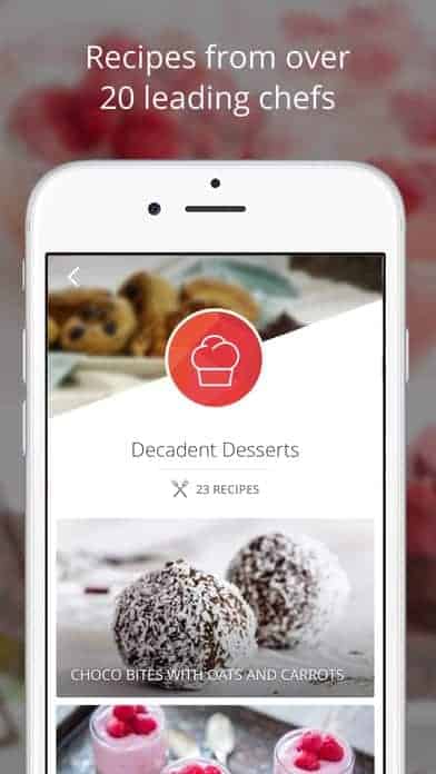
Fork Over Knife has a strong repertoire of recipes and much more added each week. The mobile app UI design is a clean and minimal white, with pops of red to accent, and of course tons of mouth-watering images of the recipes.
 Source:
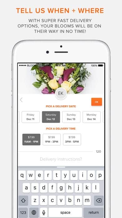
BloomThat is a relative newcomer in the card and flower delivery space, but their presentation blows the competition out of the water. With this mobile app UI, BloomThat has nearly made the flower ordering process as delightful as the smile on the recipient’s face.
 Source:
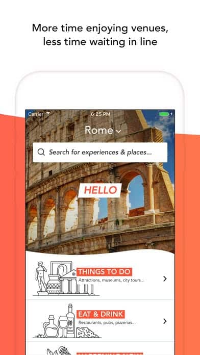
Musement takes the guesswork and even the lines out of exploring a new place. Get the most out of your travels with this smooth mobile app UI design that presents the most useful information in an appealing way, so that you can quickly start exploring.
 Source:
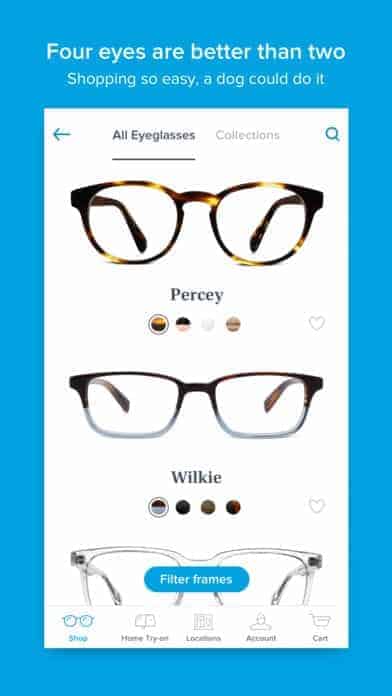
Warby Parker has taken at-home try-ons to the next level, by making use of the face mapping TrueDepth technology built into the iPhone X. It perfectly blends minimalist design with crisp images of products, enviable icons, and product information.
 Source:
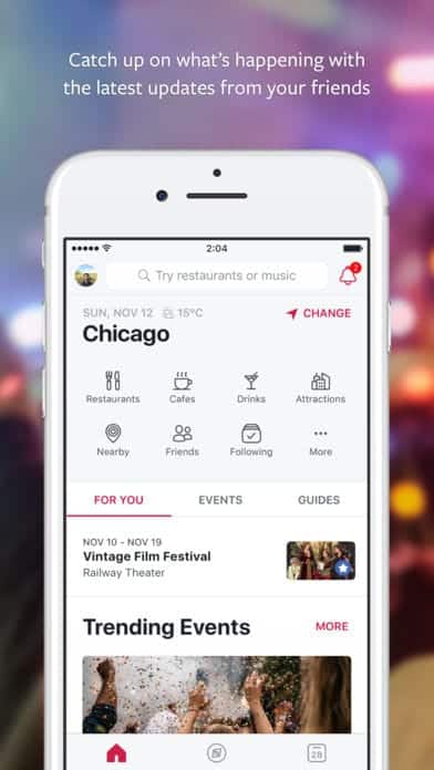
With Facebook Local, you can find restaurants, bars, etc., around you with high ratings. This app takes on a lot, from helping users plan Facebook events to finding out what’s popular with friends this upcoming weekend, but they manage to pull it together in a colorful and (most importantly) useful way.
 Source:
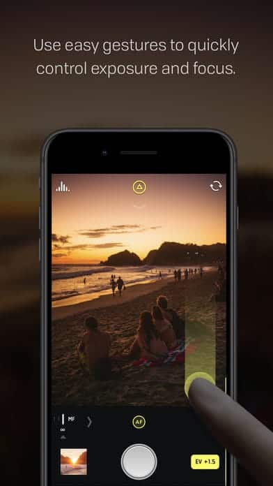
Halide is a camera app that brings the tactile excitement of the manual camera to your smartphone. The user experience within this mobile app UI design is excellent because the creators understand that the user will often be using one hand as they try to quickly capture the moment.
 Source:
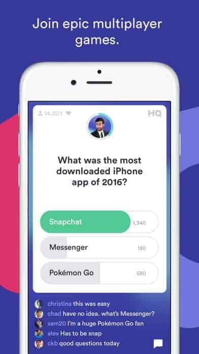
HQ is a trivia app with a mashup of bright purples, pinks, blues, and yellows that blend perfectly. HQ is far from perfect, as it lags and even has to be rescheduled from time to time, but it’s still an interesting perspective on where mobile app UI design is currently.
 Source:
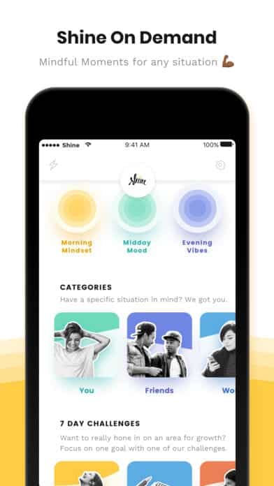
Shine is a delightful new motivational app that aims to bright a positive light to its users’ lives. They very effectively use shades of their main soothing color to accent each screen.
 Source:
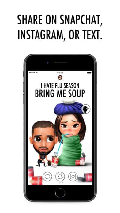
Genies are super personalized avatars (or, “mini clones” as the company calls them). When you make your Genie just like you inside and out, it’s time to have it interact with friends and share it out, which they make easy with social share buttons below each of your creations.
 Source:
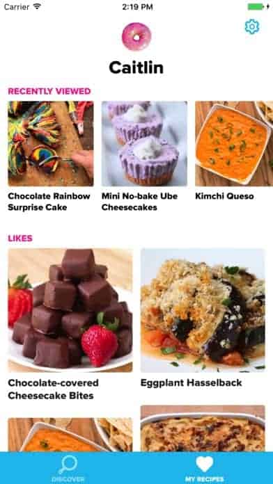
Runtasty combines tasty food photography with a delightful pink design. In this comprehensive app, it is easy to explore new recipes and save your favorites.
 Source:
That wraps up the top mobile app UI designs for 2017. Did we leave any out? Be sure to leave a comment with apps we should check out next.
Feeling inspired? Sign up for free with and prototype your own app in minutes.
If you enjoyed this curated list of great mobile app designs, share it with your social network! Do you have a suggestion for the next edition of our Top Mobile App UI series? Reach out to us via Twitter or on.
Source
https://blog.proto.io/best-mobile-app-ui-designs-2017/
Gather’s Mobile App: New Look, Feel and Features
Best Mobile App Developer – How to spot a unicorn?